
Showing posts with label Ancillary texts. Show all posts
Showing posts with label Ancillary texts. Show all posts
Tuesday, 23 April 2013


Wednesday, 20 March 2013
Magazine Advert- Mock Up
Having looked at magazine adverts which were particular to the Indie genre I have found that in general they all follow the typical conventions which the inclusion of:
- Album title
- Artist name
- Company logo
- Release Date
- Reviews
One of the key conventions which is usually found on a magazine advert is the album cover, however this was something which I have found to be challenged throughout those which I have studied in close detail. On the Mumford and Sons advert there was not any inclusion of the album cover just the use of the artists themselves in order to allow an audience to make a connection to them. Also on the Arcade Fire and The Vaccines advert despite The Vaccines one having the album cover faded as the background of the advert they both had a smaller version of the album cover situated somewhere on the advert.
This challenge of the typical convention is something which will work brilliantly for my magazine advert as I have decided to create a narrative enigma around the models on my digipak. I will be able to include this theme into the magazine advert by having the main image construct the identity the model. In addition to this as shown by my research in to adverts within my genre, the album cover isn't always used as the focal point on the advert but is still included in small elsewhere on it, I am going to use this convention within my magazine advert.
Magazine Advert Mock up-

Magazine Advert Mock up-

My advert will be taken in black and white that way the writing of the album title, artist and release date will stand out as it will either be written on a white board or chalk board.
Also the model will be in all black as again this will ensure that the board and the information is the focal point of the advertisement.
Lastly the photo is going to be taken in a high street that way it looks like the image is part of a real advertisement campaign, making it more realistic for the audience.
Friday, 19 October 2012
Digipak- draft
Draft:

On receiving feedback I have learnt that I need to add in the spines in order to give the digipak a complete look, also by doing this I am sticking to the conventions of a digipak which is important as it allows an audience to identify the product. Also one member noted that the CD panel stood out with the change in colours, this was something which split my focus group as they weren't sure if it was effective or not.
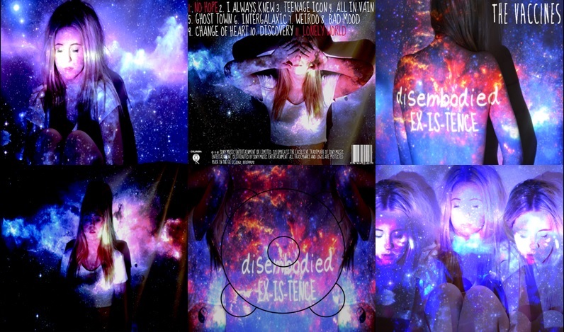
When shown to members of my target audience they all generally liked it, saying that the galaxy theme was something which they could relate to as being predominant in their style. Also that the contrast of the white text against the background allows it to stand out but not in an obvious way. By this they implied that the way in which the text has been superimposed onto the images isn't obvious and gives the digipak a simple but effective and professional look.
Subscribe to:
Posts (Atom)