Draft:
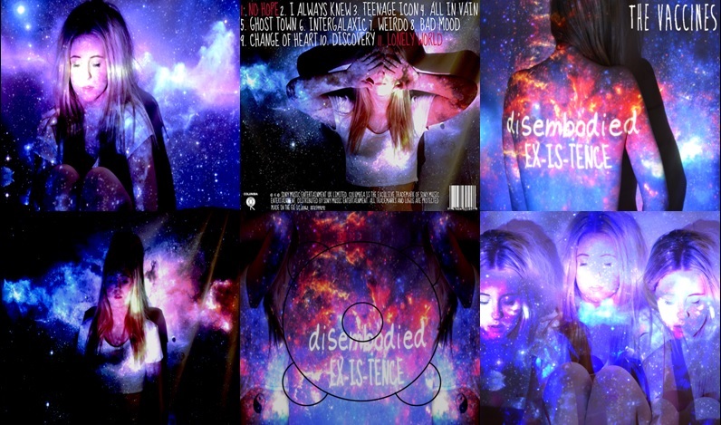
When shown to members of my target audience they all generally liked it, saying that the galaxy theme was something which they could relate to as being predominant in their style. Also that the contrast of the white text against the background allows it to stand out but not in an obvious way. By this they implied that the way in which the text has been superimposed onto the images isn't obvious and gives the digipak a simple but effective and professional look.
On receiving feedback I have learnt that I need to add in the spines in order to give the digipak a complete look, also by doing this I am sticking to the conventions of a digipak which is important as it allows an audience to identify the product. Also one member noted that the CD panel stood out with the change in colours, this was something which split my focus group as they weren't sure if it was effective or not.